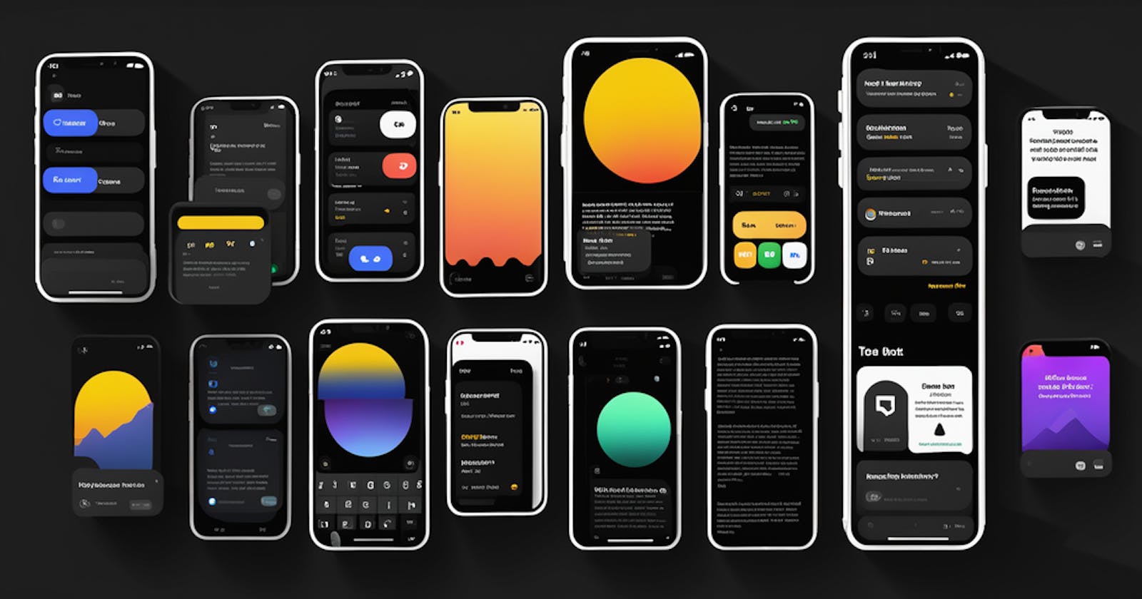
Dark mode design considerations for mobile apps

As a mobile app developer, I am always looking for ways to improve the user experience of my apps. One way to do this is to design for dark mode. Dark mode is a user interface setting that allows users to switch to a darker color scheme for their apps and devices. This can be more comfortable for users' eyes in low-light environments, and it can also help to improve battery life.
Before we get into key considerations, let's understand the benefits of dark mode.
Benefits of Dark Mode
In a dark environment, dark mode can be more comfortable for users' eyes. The bright light from a phone screen can be jarring in a dark room, but dark mode reduces the amount of light emitted from the screen. This can make it easier to use your phone in low-light conditions without straining your eyes.
Dark mode can help to improve battery life. When your phone's screen is emitting less light, it uses less battery power. This means that you can use your phone for longer on a single charge without having to worry about running out of battery.
Dark mode can make it easier to focus on the content of your app. By reducing the amount of visual clutter on the screen, dark mode can help you to focus on the tasks that you are trying to complete. This can be especially helpful for users who are easily distracted.
Key Considerations for Designing Mobile Apps in Dark Mode
Use high-contrast colors
Dark mode is all about using high-contrast colors to make text and other elements easy to see. Avoid using pure white text on a black background, as this can be too harsh on the eyes. Instead, use a slightly lighter shade of gray for text, and use even lighter shades of gray for other elements, such as borders and icons.
Use a dark background
The background of your app should be dark in dark mode. Avoid using pure black, as this can be too dark and oppressive. Instead, use a dark shade of gray.
Use shadows and highlights sparingly
Shadows and highlights can be used to add depth and dimension to your app's interface. However, use them sparingly in dark mode, as too many shadows and highlights can be distracting.
Test your app in dark mode
Once you have designed your app for dark mode, it is important to test it to make sure that it is easy to use and that all of the elements are visible. Test your apps in dark mode on a variety of devices and under different lighting conditions.
Also Read ⬇️
Tips for Designing for Dark Mode:
Use complementary colors
When choosing colors for your app's interface, use complementary colors to create a visually appealing and balanced design. For example, you could use a dark blue background with light yellow text.
Use translucency
Translucency can be used to create a more subtle and layered effect in dark mode. For example, you could use a translucent overlay on a dark background to create a semi-transparent menu.
Use animations
Animations can be used to add interest and dynamism to your app's interface. However, use them sparingly in dark mode, as too many animations can be distracting.
Accessibility
Make sure that your app is accessible to users with visual impairments. This means using high-contrast colors and large fonts, and avoiding complex user interfaces.
User experience
Consider how dark mode will impact the overall user experience of your app. For example, you may need to adjust the spacing of elements or the size of buttons to make them easier to use in dark mode. Read more about Mobile UI guidelines
Consistency
It is important to maintain a consistent design across both light and dark modes. This means using the same colors, fonts, and icons in both modes.
By following these tips, you can design mobile apps that are both beautiful and functional in dark mode.
Overall, dark mode is a valuable feature that can improve the user experience of mobile apps. By following the tips above, you can design apps that are both beautiful and functional in dark mode.
And that's it for today 🫡, See you soon in the next article.
 Develop and Solve